Unleashing a spectrum of colour
A look into the visual identity of the Klarian brand
A brand’s visual identity is what allows people to recognise a brand. Colours, logos, visual assets all make a brand memorable and help it differentiate. Early on during the rebrand process, we decided that we did not want to be conventional. The Klarian visual identity is distinctive and, at every level, reinforces the idea of the performance clarity that we deliver.
Standing out
Colour is often the first thing people see. The best brands are identifiable by just their colours. Think about Google, Microsoft, or BP: all three have a distinctive colour palette that most people could match to the brand immediately. Colour informs the whole look and feel of a brand. It was a crucial part of the Klarian rebrand.
The Klarian colours are bright and striking: a vivid red, green, and blue standing out amongst all the blue technology companies. We did not just choose these colours because they looked good (which they do). We chose them because they reflect and reinforce the value that we deliver.
The Klarian colours look to evoke the insight we provide by unleashing a spectrum of colour. The colours reference the red, green, and blue of RGB screen technology. By combining these three, any colour is possible. They make sense for Klarian because our insights bring pipeline operations into full HD colour.
We no longer exist in the same part of a colour wheel as many other technology companies but sit smack bang in the middle.

A distinctive logo
If colour is the first thing people see, the logo is what people will remember. If you were to forget the name of a company at any point, the chances are that you will remember what the logo looks like. A logo should make your brand instantly recognisable. People or other companies should be proud to put your logo alongside theirs.
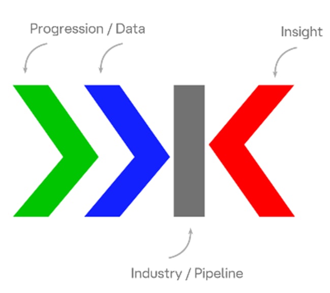
Designing the Klarian logo was a big step. Our logo is clear, concise, and confident in its simplicity. The coloured chevrons are distinctive, capturing the eye and conveying our agility and dynamism while evoking the progression and insight we deliver.
We are proud of our new logo and brand icon. They also pass an important test; our staff are happy to have them up on our office walls.

The Klarian flow
A brand’s visual identity can be more than a logo and some colours. Some of the world’s most recognisable brands have other ways of identifying them. Think Michelin Man or the Netflix ‘ta-dum’. These brands have developed assets that add another layer of disctinctiveness so that you can recognise a brand by a mascot or sound with no name or logo necessary.
Throughout our website and LinkedIn, you will see a colourful wave. We have named it the Klarian Flow. It represents the constant, end-to-end flow of information and data that Klarian turns into actionable intelligence for its clients.
Whenever you see this flow, you will think of Klarian.
A colourful identity
The Klarian brand identity reflects who we are and what we do. Klarian shines a light on pipelines, bringing operations into colour so that you can safely, efficiently, and profitably manage your assets while complying with strict industry regulations and protecting the environment.