A colourful evolution
An update on the rebrand to Klarian Limited
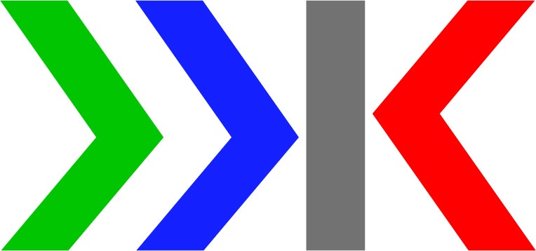
As teased earlier in the week on our LinkedIn, we have a major announcement. Dashboard Limited is evolving. We have rebranded as Klarian Limited. From the name to the logo, our new brand identity strikes at the core of our offering - helping industry see more clearly.
The courage to rebrand
Good brands are not static. They will evolve and change as a company grows and develops. You would not be afraid to give your house a fresh coat of paint if the colour no longer matched your furniture, so you should not be afraid to rebrand. If you let fear stop you from taking the leap, you might find your company quickly loses its shine and relevance.
Rebranding is daunting. No one wants to become a punchline on Twitter, but no one should want to trail into obscurity either. Apple, the BBC, Microsoft, and Rolls Royce. What do all these brands have in common? They were not afraid to rebrand.
We are no different.

Making the right choice
With other significant announcements on the horizon as we commercialise further, it is the perfect time to ensure our brand reflects our quality and individuality. After a period of intense research and reflection, we took the bold decision to overhaul our brand identity.
The existing Dashboard brand identity fitted in nicely with the swathes of blue technology companies. It was safe, familiar, and unobtrusive. But these conservative characteristics do little to advance a business’ special, individual strengths. Who would want to be lost in the crowd?
Similarly, the name ‘Dashboard’ feels too generic. It was intended to express simply how we visualise data, but dashboards are hardly unique. Most software companies use them, and we don’t want to be mistaken for one. Although our dashboards are an essential part of our service, we offer so much more through our end-to-end intelligent pipeline monitoring solution, Digipipe.
After reaching these conclusions and providing a renewed focus on our compelling competitive proposition, we grabbed the bull by the horns and decided to rename as well as rebrand.
Finding clarity
Klarian is a coined word stemming from ‘clarity’. It encapsulates, in one word, what we do but with a distinctive ‘K’. We exist to optimise pipeline infrastructure for a more sustainable planet. We do that by collecting pipeline data and transforming it into performance clarity.
The Klarian colour scheme supports this. It is vibrant, bold, and strikes a chord within the existing sea of blue. We have unleashed a spectrum of colour that evokes the insight that we provide.

A reinvigorating renaissance
All of us at Klarian helped sculpt and form our new brand identity, so we are thrilled to finally bring Klarian into the world.
Rob Clegg, our CEO, said it best: “I am delighted with our new brand. We worked with some excellent creatives, and we all feel we now have a brand that suits us. The development process was a real team effort, so everyone has a real sense of pride and ownership in Klarian. The new brand effortlessly illustrates who we are and how we help optimise operations and protect the environment, even in the smallest details. We are excited to reintroduce ourselves.”
Find out more
Follow us on LinkedIn and keep an eye on our blog to learn more about the rebrand and what we are up to.