Updating Digipipe's front-end: Why UX and UI design is important
We all have various apps or programmes on our phones and computers. The good ones are easy to use and intuitive to understand. If an app feels clunky or confusing, chances are you will uninstall it and choose another.
To generate and retain users for products, you need excellent user experience (UX) and user interface (UI) design. Klarian’s intelligent monitoring platform, Digipipe, optimises operations and identifies efficiencies. While developing our user interface, we kept the user in mind at every step. Recently, we’ve updated our front-end, so we thought we’d take you through that process.
What is UX design?
UX design ensures products are intuitive and relevant for the user and offer a good experience.
UX can relate to nearly anything, whether it's physical or digital. Consider the mouse you may have used to navigate this web page: the designer would have thought long and hard about how it feels. An unresponsive mouse would create a frustrating user experience, so a good UX design for a mouse would be to make it as smooth and responsive as possible.
What is UI design?
Whereas UX design can be physical or digital, user interface (UI) design is solely concerned with the digital. UI design is the process of designing how interfaces like a software front-end or website appear and act.
UI design is concerned with navigation, visuals, and controls. If you’re on a homepage and want to navigate to a blog, you want to be able to do that as quickly as possible. Good UI design will make navigation clear and simple. For example, buttons will be obvious, and colour will enhance the interface rather than confuse it.
Why are UX and UI design important?
UX and UI design are critical for enabling user acquisition and retention. Imagine that you are looking online to solve a problem: if you navigate to a website you can’t read because of clashing colours or it is counter-intuitive to use, you probably won’t linger.
At Klarian, we take UX and UI design seriously. We developed Digipipe to optimise operational management and identify efficiencies, so we designed our front-end to be highly intuitive, configurable, and easy to use.
Updating our front-end
When Klarian rebranded in September 2022, we launched the Klarian colour palette and visual identity and took the opportunity to update our UI and review our UX.
Designing a new front-end
When designing the new colour palette for the front-end, the team faced three challenges:
- Designing a product that would integrate the new branding and colours
- Ensuring the front-end remains accessible to all users
- Delivering a strong and attractive UI
The team were excited about our new company branding and the fresh face it gave the company. We needed to integrate the three core Klarian colours into a system to produce a light mode and dark mode interface. Simply choosing black or white is boring; we wanted to use different accents and backgrounds, so the front-end did not resemble a typical grey-themed SCADA system.
The first step was to draw from the RGB colours of the logo and expand these into separate palettes to give us optional hues.

A new colour palette
Take the Klarian blue. We expanded this out into darker tones using a colour palette generator which produced the following colours from the single hue:

From the darker shade, we added a small amount of blue, and then produced the main palette we would feature on the front-end – lovingly dubbed “Klarian Slate”:

The above shades are featured in the background, buttons, and other elements which we implemented into the “dark mode” of Digipipe as a base colour. To offset the dark background, and to create an accent on elements such as buttons, we created a lighter palette that used both Klarian green and blue:

The team really liked the mint colour produced in the palette above and used “Klarian-Mint” within both the light and dark modes. When used together, they contrast well, creating a better user experience.
We designed and integrated the colour palette with accessibility in mind. We regularly test our app against the Web Accessibility Guidelines, to ensure our app is accessible with a strong UX for everyone.

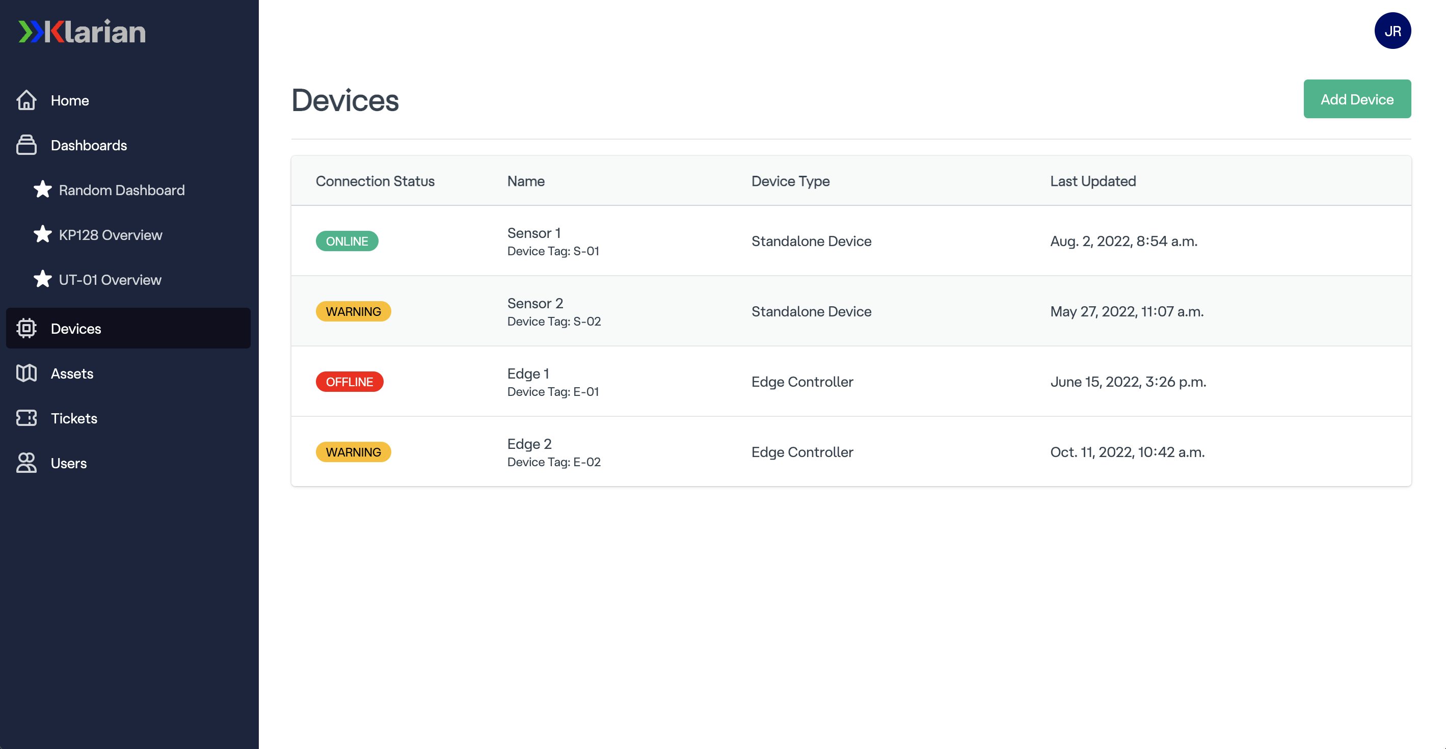
Light Mode

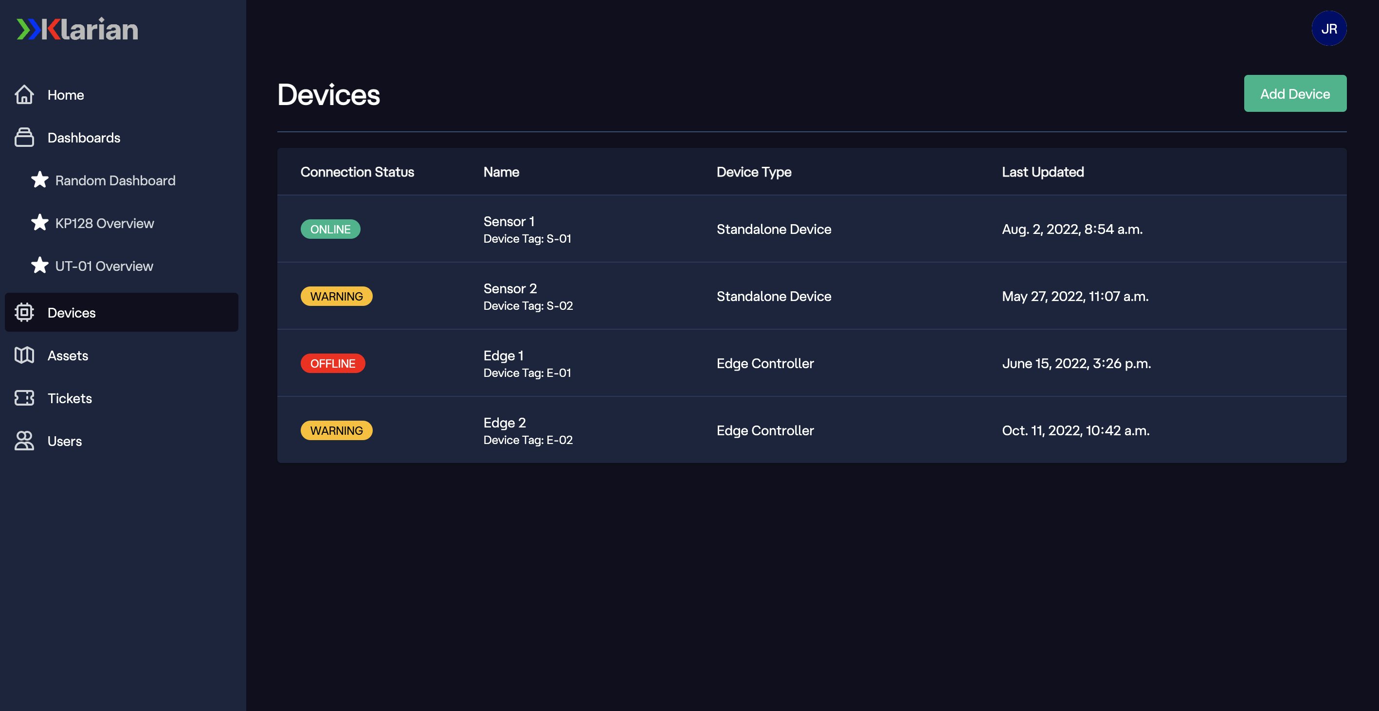
Dark Mode
An alert palette
For our alerting and charting purposes, we needed a RAG (red, amber, green) system. We already had red and green from the original Klarian palette but lacked an “amber”, so we created one using the same colour palette generator:

These colours were also integrated into some button and charting elements as it worked effectively together as a theme:

The contrasting of colours was important to draw the user to the important elements and information and gives the app a modern and simplistic feel.
Digipipe's front-end
At Klarian, one of our core philosophies is making the lives of our customers easier. We believe in the transformative power of data to help drive faster, more informed decision-making to deliver operational efficiencies.
Digipipe provides a single point of truth that centralises and humanises your many data streams to provider users at any level with timely and actionable insights. Since we considered UI and UX at every level while designing our front-end, you can understand these insights at a glance wherever you are.
If you are interested in learning more about enhancing your operational efficiencies, sign-up to our newsletter or follow our LinkedIn.